Concept
We live in the information age that everyone wants to access the new information as fast as possible. In our daily lives we are used to being bombarded with information overload from everywhere.
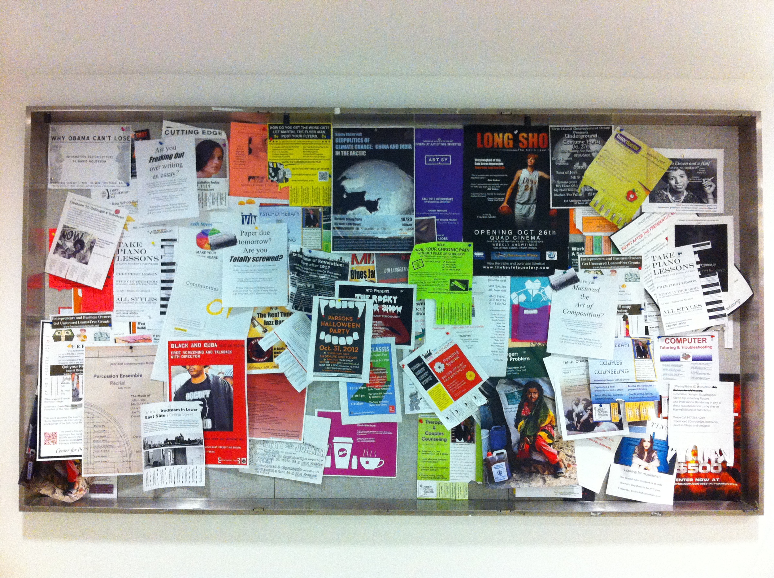
In the case of mine, D12 floor, a public space for graduate students, where I came to stayed and worked almost every day. I noticed that I am surrounded by a lot of information from print materials such as posters or flyers. Even though, they are informative, they do not bring attention to viewers that much since posters are unorganized, overlapping and too much information.
According to the observation, I question myself of how to bring more attention from viewers as well as seeing just essential information. This project is an exploration on visual perception. There are two experimentations that need to be experienced for my project.
User testing with color palette to see the visibility.
User testing with color palette to test the visibility / readability.
New templates for my post board.
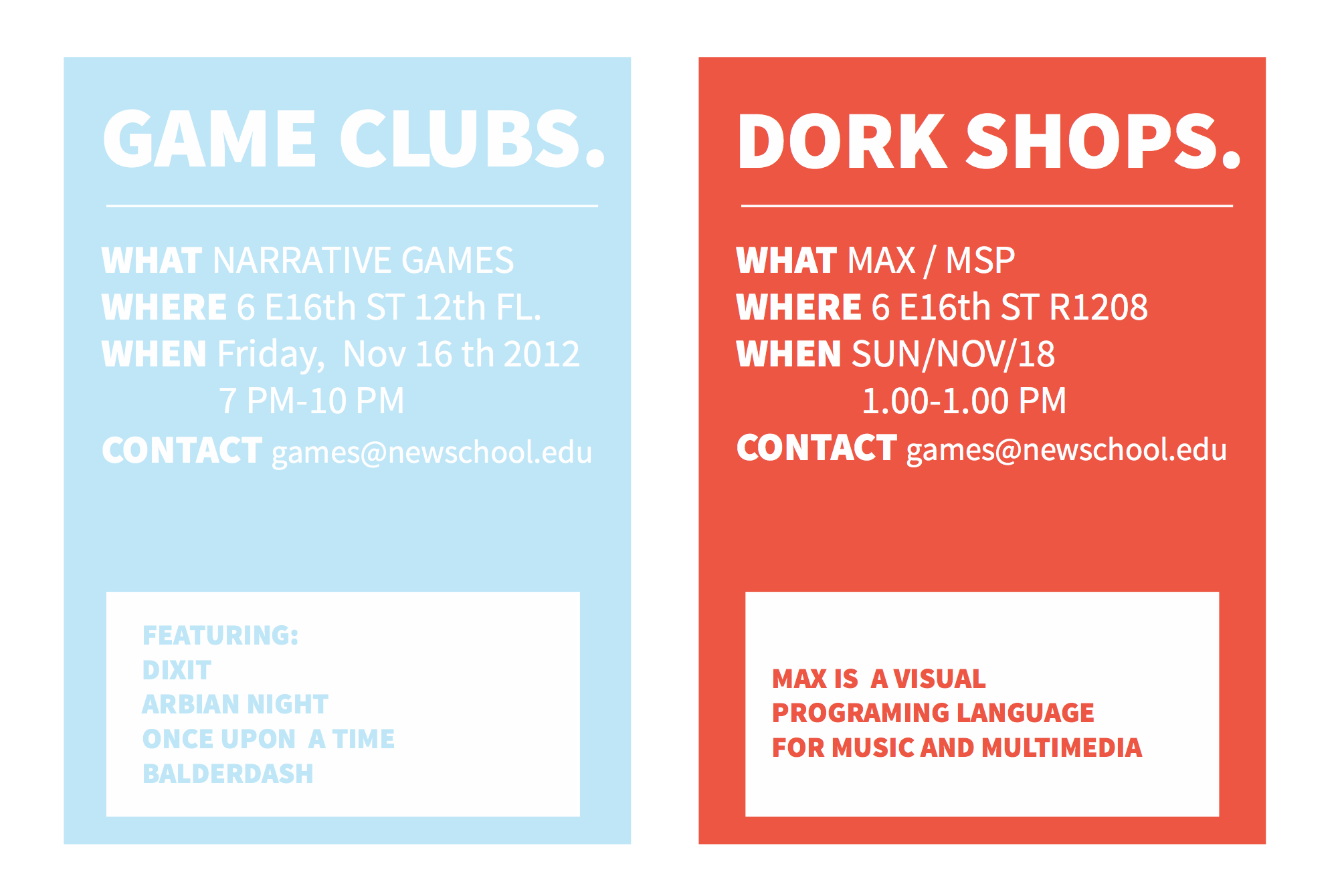
Final setup with new visible / invisible post board. My goal is to simplify each paper that it can be seen (what/why/when/why) easily and clearly.
User testing
User testing 2 : Getting feedback from users.
My first experimentation was to categorize and re-arrange posters on D12 into a group of topics by label them with different colors, so that they will be easy to look and use. Then, observe user reaction that they will follow a new system.
The second experimentation was to create a new template serves as a way to filter out the superfluous and provide the user with just the essentials. When the user wears the glasses, only the essential information is provided for them. Therefore, they are not caught up in reading all the information that is specific to only one event. If the user is interested in a particular topic then they are free to take off the lenses and see everything that is written about for a specific event.
This prototype will be installed in a specific area on D12. Users will be provided with a pair of glasses that when they wear it, they will see just essentials information (what, where, when, why) on each poster.
In short, this project aims to either bring more attention or adjust users behavior through the new system and template of posting.


